Cartography
Whist I was researching Mountain ranges I came across a beautiful lithograph by German cartographer August Heinrich Petermann. After this research, I was thinking about creating some sort of long image showing a mountain "range". This displays that sort of idea. I can't imagine it an uncommon idea to create images of mountains on a landscape platform as it just fits so well.


An 1865 lithograph showing the High Tatras mountain range in Slovakia and Poland by Karel Kořistka appearing in a book by August Heinrich Petermann.
I thought I would I should take a look at the work of Karel Koristka and August Petermann as cartography is something I consider pretty relevant when looking at the mountains. You wouldn't be able to navigate the mountains without a map after all.

August Petermann, a German cartographer, was born Apr. 18, 1822. Petermann was a skilled map maker who came to Scotland in 1845 to assist the English map maker A.K. Johnston produce his atlas (Johnston had permission to translate into English the thematic atlas of Heinrich Berghaus, a German cartographer with whom Petermann trained, and Johnston no doubt found Petermann invaluable in translating the maps and redrawing them). Petermann then moved to London at about the time that the Franklin expedition to the Arctic got lost and the Admiralty sent dozens of ship to the rescue; when each expedition returned, there were maps to make. He published a colored map of the supposed “Open Polar Sea” in 1852 (detail, first image), which we displayed in our 2008 exhibition, Ice: A Victorian Romance.
Peterman became a member of the Royal Geographical Society and was particularly interested in promoting expeditions’ to Africa, and he published one of the first accurate maps of central Africa in 1857, following the expeditions of Heinrich Barth and David Livingstone (detail, third image). But then Peterman returned to Gotha in central Germany and took over the geographical institute that had been set up there by the publisher Justus Perthes. Soon Petermann was editing and publishing his own geographical journal, Petermanns geographische Mittelungen(founded in 1855), which would rapidly become the most respected cartographic journal in the world. The journal was published up until 2004; we have a long run in the Library, but it only goes back to 1879, so we are missing the first 24 years, the volumes that Petermann edited. One volume we do have is volume 63, published in 1912 (fourth image), containing Alfred Wegener’s first papers proposing the idea of continental drift (fifth image).
Petermann suffered from bouts of depression in his later years, and he took his own life in 1878. He was 56 years old.

Augustus Herman Petermann: Karte Von J. Palliser's Expedition zur Erforschung der Rocky Mountains In Britisch-Nord-Amerika, 1858. Found on Barry Lawrence Ruderman Antique Maps Inc.
Description (above image):
Detailed map of Western Canada illustrating the western part of Captain John Palliser's explorations in Western Canada, based upon Palliser's virtually unobtainable map published about three years earlier.
The map shows the disputed boundary claim vicinity of the San Juan Islands and the route of Palliser. engraved with mountains shown via hachure. Engraved line and hand coloring delineates the routes of Capt. John Palliser, Dr. James Hector, and Capt. T.W. Blakiston. Legend locates creeks, camps, portages, rapids, and more.
Maps by Southworth and Southworth


Maps by Southworth and Southworth
One of my tutors who is an absolute wizard with maps gave me a great book to look at: Maps.

I like how mountains or elevated areas are shown on this, just little drawn mountains. This map reminds me of the sort of map from Lord of the Rings, I suppose because this is an older way of drawing maps.

Computer Generated Topographic Map
This sort of map isn't limited to topography, it could be used to show other variables such as population growth. This is interesting, it has just occurred to me that a "mountain" could be a symbol in itself, showing hight elevations of population, productivity etc. High and low.
This also reminds me of gravitational wave maps in space.

Landsat View
taken by a multi-spectral scanner in a satellite orbiting earth. It focuses on visible and near-infrared light waves reflected from earth with is measured but the radiation detectors in the satellite. The values are covered to digital form. Colours are not natural so as to give a better description of elements than a real photograph.
Red- vegetation
Blueish/ yellow/brown- soil and rock
Blue/black- water
These maps have not been especially helpful in geology.

Computer Generated Concealment and Topography Maps

Digitized Topographic Map of Mount St. Helens
Spacing between lines is very effective in giving the illusion of steepness. The images bellow go so far as using a wrapped grid like cross hatching to show more detail on the landscape.

Air Landing Graphic

Bryson: Topography and Vegetation
Using shadows and colours to show terrain focusing on topographic contours and forested areas. Simplified maps are to the left of the main image.

Raised Relief Topographic Maps and Stereo Map: Lycoming and Clinton Counties Pennsylvania
Top image is a tree dimensional model form on modelled plastic sheet where vertical dimensions are exaggerated.
Bellow, cereal photographs made in stereo pairs.

Topographic Map of Switzerland
19th century engraving. Shadeing to give this a three dimensional feel and create mountain form. Short lines (hachures) indicate slopes, thicker lines indicate steeper slopes. The greater of this map, Genral Guillaume Henri Dufour (1787-1875) begun the survey of this map in 1830, finishing it 34 years later. Produced to be very durable.
Aesthetically, I prefer this sort of map to the digital rendered maps although the time spent on them is drastically cut my digitalising the. These have a quality to them that couldn't be produced digitally. I feel as though I can almost feel the texture just by looking at them.
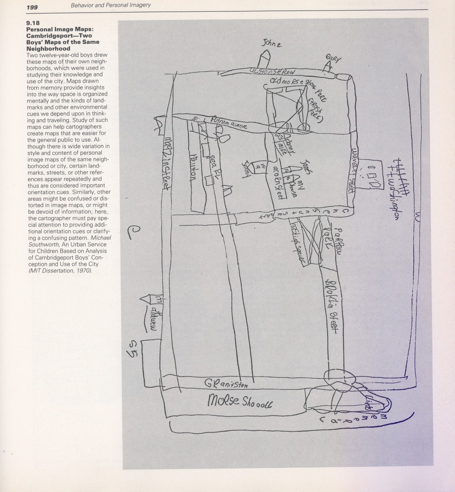
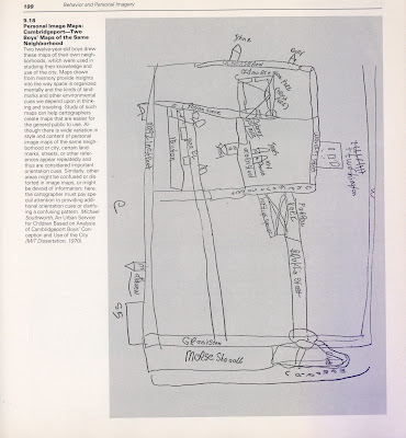
Personal Image Maps: Cambridgeport (One of Two Maps by Boys in the Same Neighbourhood)
Drawn by 12 year old boys, these where used to study their knowledge of the city. I like the difference between these and the previous maps, they don't contain too much detail and shows how people remember their surroundings. This can help cartographers produce maps that are easier to read for the general public.
With this in mind, I could try out making a map for myself. In fact I found this book in the library that might help me if I so wish to do so:

I managed to find a map of an area I used to live very close to, St. Christophe-en-Oisans. Very close to indeed, some of the mountains that you could ski from in Les Deux Alpes, can be seen on this map, such as Glacier de Mont De Lans, Lac Noir, Le Diable, etc. On the map it also states the region- Isère.


Road rout from St. Christophe to Les Deux Alpes, where I used to live.


I love the amount of detail put into Keys. The subtle difference in the path and on this it even has subtle differences to show a "good" or "bad" mule track terrain.

Key showing woodland, brushwood, orchards, gardens, vineyards etc.
It is strange that when I look at this map, the terrain is already visible to me without knowing the key. This doesn't just go for me. It is almost in out nature to be able to identify the terrain on a map. My eyes identify the shades and colours to mean depth and difference in terrain. In regards to the blue lines that show where the glaciers are, I can tell, without looking into it through research, that where the lines are closer, the terrain is steeper.
I am going to leave cartography and maps here for now to maybe revisit at a later date as I want to take a look more closely at why I have chosen to research mountains in the first place.

Comments
Post a Comment