The Great Stone Book, Work in Progress
I have been trying to work out how I could create an artist book as part of my project. I thought it was time to test out some of my ideas. There are a few paper test in a previous post that you can view here and here. After a few tests I decided that it would work best if I made the main structure to work with a draw compartment.


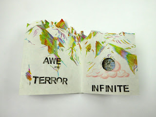
I initially made the concertina book that are he 'pages' to the book. This was inspired by the earlier concertina I made which can be seen here. However i does differ in texture and tone. I think using the black ink on the earlier piece was a good choice and worked well. I was a little afraid of attempting colour with this, which is strange for me as I usually go straight in with it but I thought that using colour might take away from the map on he reverse side, it might not compliment it etc. so I had to experiment with colour and material.


Final
I decided to go with one of the magic pencils. This is one of the tools I used to do a sketchbook drawing when I was in the Alps. I almost have muscle memory with the way I use if to show ridges and the highlights of the mountain so not only does it work in that way but I also have a connection with the material. I also believe it was the most successful in terms of working with the map as well as creating a contrast.


Looking at spirals to go inside the "body"of the mountain so that it could be hung up with these spiralling down from within. However after some tests, it seemed that the mountains looked more like a bell and this isn't really what I was going for. After a lot of sketching out ideas I came up with the idea of a draw, see tests bellow.


Before Building The 'Cover'.
I initially made the concertina book that are he 'pages' to the book. This was inspired by the earlier concertina I made which can be seen here. However i does differ in texture and tone. I think using the black ink on the earlier piece was a good choice and worked well. I was a little afraid of attempting colour with this, which is strange for me as I usually go straight in with it but I thought that using colour might take away from the map on he reverse side, it might not compliment it etc. so I had to experiment with colour and material.

First test. I wanted to see how a pink would work against the colours of the map. However I didn't find that this was helpful, I needed to see the colour in a material close to what I would want to work with.


I wanted to test out colours that where completely the opposite of the dark ink I had used before, I went for full vibrancy. This worked better than testing it against the coloured paper. The image above, left shows the first test but it was a little small to see clearly so I did a second one with more surface area for the colours.

I then compared this with the previous finished piece. The small test was a little too garish , especially viewed next to this one. I needed to keep testing.

I tried a colour that want too vibrant but not black to see how this worked. It works, but it isn't the sort of visual I wanted. These small tests helped me develop some colour ideas but also made me realise that maybe paint wasn't the way to go.

I decided to made a test that would be the same size as the final concertina to best see the colour and material changes. This has a variety of test in it including the Posca pen paint that I has already been using on the smaller test but also coloured pencil, magic pencil and felt tip.


Bellow are closer looks at how each colour and material works with the map. There are also test with how text would work over the material/ colour and with the map.


Final
I decided to go with one of the magic pencils. This is one of the tools I used to do a sketchbook drawing when I was in the Alps. I almost have muscle memory with the way I use if to show ridges and the highlights of the mountain so not only does it work in that way but I also have a connection with the material. I also believe it was the most successful in terms of working with the map as well as creating a contrast.


I then made this into a GIF.
I wanted to create my 'cover' with a similar idea of one of my earlier pieces, seen here. I begun to build the mountain from the top down so that i would layer downwards. I ripped the card to give the sections a raw feel, this also created natural tears which flowed nicely with the idea of mountain ridges. Once I had built up a substantial amount of the mountain I needed to build in a section for he draw.
I began by making the compartment of the draw in which the book would sit (seen bellow). this required a lot of measuring. I also had to think about how the concertina book would sit in the draw, I wouldn't want it to move around or the 'pages' would damage. I made a strip from ribbon that would allow the book to hold tight. I also added an extra ribbon which could be used to lift he book before taking it out to avoid damage to the 'peaks' of the mountains as they are quite fragile.


Left over map used on the side of the draw so that it can be seen when the draw is pulled out.

Detail of ribbon. Title of the concertina printed on with letraset. The name la "Crȇte" seen here was left there on purpose as this is an area I used to visit (la Crȇtes, Les 2 Alpes) and it also means ridge which are seen on the concertina itself.
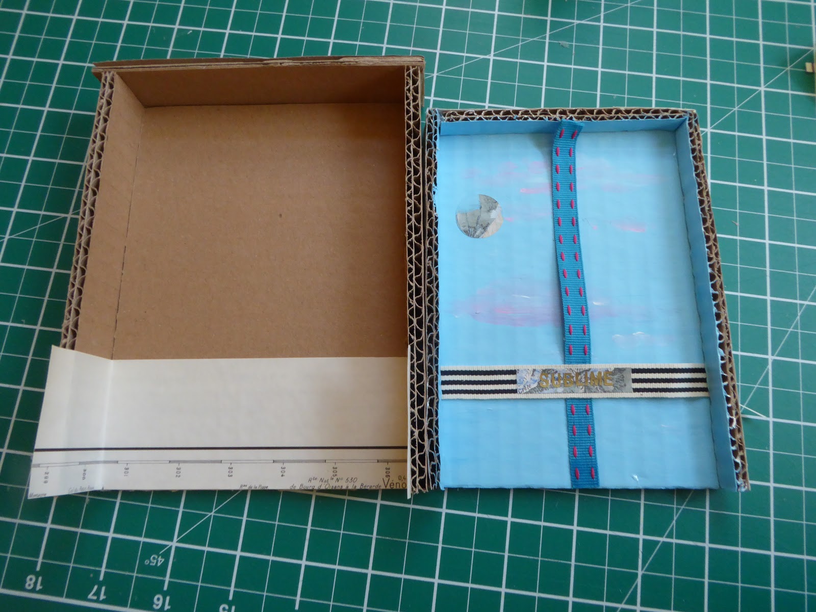
Progress of developing the container for the draw. This will hold the draw in place inside the mountain 'cover'. It will also have a top to it. Some map added to the inside of this so that if the draw is pulled out, it is not just cardboard, bu the 'inside' of the mountain.


Cardboard layers used to elevate the draw container off the floor of the mountain.

The cardboard had to them be built up around this as well as the draw front being added. This draw front needed to fit with the til of the mountainside. I then added a small handle out of book binding thread so that it stays strong but also isn't especially noticeable.
Once this was done I then has to pain the mountain, giving it more texture, form and contrast. I wanted to use black and white as the book 'pages' are colourful so I wanted to create a contrast to this. I also wanted to give the idea of a dangerous place but once it is opened it is something more delicate and beautiful. This is following the idea of he sublime. This response is sort of the first response in attempting to understand the sublime.
Once this was done I took photos of it in the studio as well as on the beach to get a feel of the natural environment. Bellow is a GIF I made but see the next post for the final outcome images.

Comments
Post a Comment